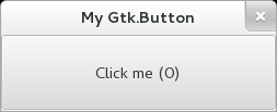
The Button widget is generally used to trigger a callback function that is called when the button is pressed.
The various signals and how to use them are outlined below.
The Button widget can hold any valid child widget. That is, it can hold almost any other standard
Widget. The most commonly used child is the Label.
CSS nodes
GtkButton has a single CSS node with name button. The node will get the style classes .image-button or .text-button, if the content is
just an image or label, respectively. It may also receive the .flat style class.
Other style classes that are commonly used with GtkButton include .suggested-action and .destructive-action. In special cases, buttons
can be made round by adding the .circular style class.
Button-like widgets like ToggleButton,
MenuButton, VolumeButton, LockButton
, ColorButton, FontButton or
FileChooserButton use style classes such as .toggle, .popup, .scale, .lock, .color,
.font, .file to differentiate themselves from a plain GtkButton.

Example: Button:

public class Application : Gtk.Window {
	private int click_counter = 0;

	public Application () {
		// Prepare Gtk.Window:
		this.title = "My Gtk.Button";
		this.window_position = Gtk.WindowPosition.CENTER;
		this.destroy.connect (Gtk.main_quit);
		this.set_default_size (350, 70);

		// The button:
		Gtk.Button button = new Gtk.Button.with_label ("Click me (0)");
		this.add (button);

		button.clicked.connect (() => {
			// Emitted when the button has been activated:
			button.label = "Click me (%d)".printf (++this.click_counter);
		});
	}

	public static int main (string[] args) {
		Gtk.init (ref args);

		Application app = new Application ();
		app.show_all ();
		Gtk.main ();
		return 0;
	}
}
valac --pkg gtk+-3.0 Gtk.Button.vala
- public void get_alignment (out float xalign, out float yalign)
Gets the alignment of the child in the button.
- public bool get_always_show_image ()
Returns whether the button will ignore the
gtk_button_images setting and always show the image, if available.
- public unowned Window get_event_window ()
Returns the button’s event window if it is realized,
null otherwise.
- public bool get_focus_on_click ()
Returns whether the button grabs focus when it is clicked with the
mouse.
- public unowned Widget? get_image ()
Gets the widget that is currenty set as the image of
this.
- public PositionType get_image_position ()
Gets the position of the image relative to the text inside the button.
- public unowned string? get_label ()
Fetches the text from the label of the button, as set by
set_label.
- public ReliefStyle get_relief ()
Returns the current relief style of the given
Button.
- public bool get_use_stock ()
Returns whether the button label is a stock item.
- public bool get_use_underline ()
Returns whether an embedded underline in the button label indicates a
mnemonic.
- public void set_alignment (float xalign, float yalign)
Sets the alignment of the child.
- public void set_always_show_image (bool always_show)
If true, the button will ignore the
gtk_button_images setting and always show the image, if available.
- public void set_focus_on_click (bool focus_on_click)
Sets whether the button will grab focus when it is clicked with the
mouse.
- public void set_image (Widget? image)
Set the image of this to the given
widget.
- public void set_image_position (PositionType position)
Sets the position of the image relative to the text inside the button.
- public void set_label (string? label)
Sets the text of the label of the button to str.
- public void set_relief (ReliefStyle relief)
Sets the relief style of the edges of the given
Button widget.
- public void set_use_stock (bool use_stock)
If true, the label set on the button
is used as a stock id to select the stock item for the button.
- public void set_use_underline (bool use_underline)
If true, an underline in the text of the button label indicates the
next character should be used for the mnemonic accelerator key.

